YouTube got a redesign late last year, featuring a “new, softer shade of red” and a gradient from red to purple. The previous red had been in use since 2017, and it turned out to have several problems.

Image source: 9to5google.com
According to the source, the red color previously used by YouTube was considered too harsh, looked orange on some screens, and could cause screen burn-in on TVs. These issues were addressed by using a cooler shade in the new design, making YouTube’s user interface less harsh and easier on screens.

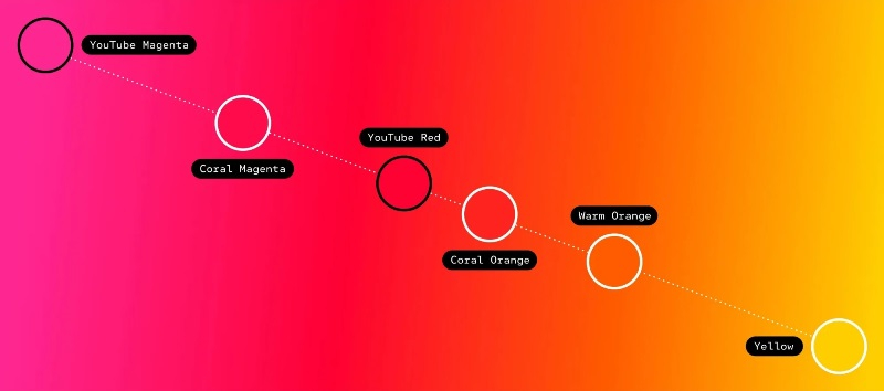
Along with the new shade of red, the platform’s interface now features a purple gradient, which can be seen in the video progress bar and some other elements. The design team explored the possibility of using orange or even yellow, but ultimately decided to go with purple because it felt like the “most natural complement” to the new red.

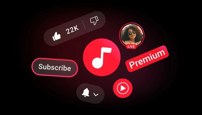
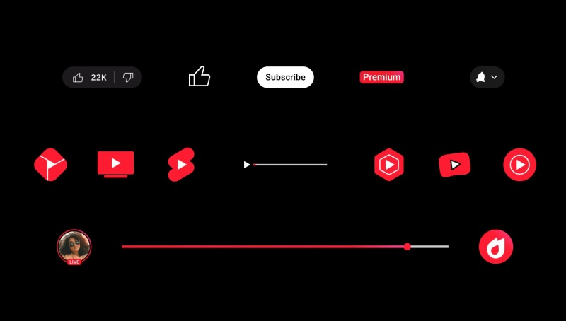
Interestingly, purple is a color that is not often found in nature, so it symbolizes progress and creativity, which is what YouTube embodies. The gradient is tilted at a 45° angle, with purple on the right, symbolizing forward movement. Red is now used more selectively in “brand marks,” identity elements, and UI elements, including the logo, icons, etc. At the same time, the gradient can be seen in the progress bar, the “Subscribe” and “Like” buttons, the Premium badge, etc.

Another aspect of the update was animation. “Our launch animation is a logo that expands and contracts with the YouTube progress bar. In this update, we added a gradient to the animation to give it an extra branded effect,” the developers said in a statement.