Microsoft has updated the illustrations used in the software giant’s products and services. The previous iteration of the illustrations was heavily vector-based, using a flat design that can be seen in many of the company’s applications, such as Teams, Skype or Office, and even some sections of Windows. Now the developers have switched to 3D design, which brings back skeuomorphism and also makes the design more colorful and playful.
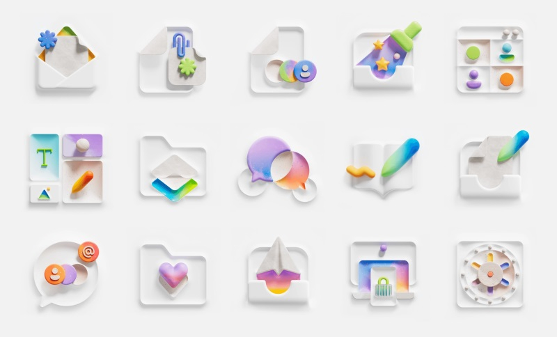
Image source: Microsoft
«Our research has shown that while on the surface the illustrations we use may be colorful, inclusive and ingenious, in the consumer environment they are perceived as uninteresting and unemotional. The flat vector style, which was once very popular in the industry, is no longer optimal and potentially conveys thoughts that are not consistent with our company values,” Microsoft said in a statement.

Microsoft has redesigned the illustrations, creating a style that should “simplify and unify products with a strong Microsoft aesthetic.” As a result, the illustrations featured many more of Fluent’s signature shapes and symbols, and the color palette became richer. The 3D illustrations are much more expressive compared to the flat and oversaturated style that Microsoft has been using in recent years.

«Our previous illustrations often duplicated the accompanying text, which created confusion. If we were more careful about how our illustrations harmonize with other elements of the user interface, then this problem could already be solved,” the developers note. Microsoft now faces the challenge of updating artwork across all of its products and services, which could take several months.