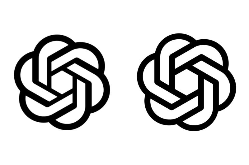
Openai conducted a full rebranding. The company’s company style now includes a new font, an updated version of the logo and an updated color palette. To notice the difference between the old and the new logo, you have to take a closer look: the “flower” has slightly increased in the center, and the lines became more clear.

Old (left) and updated (right) logos. Source of images: Openai
The original logo was developed by the Director General of Openai Sam Altman and the co -founder of the company Ilya Sutskever. Now he was slightly redesigned by the full -time designers of Openai Veit Moeller and Shannon Jager, trying to make the image “more organic and human”.

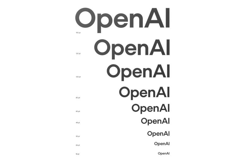
An important part of the rebranding was the new Openai Sans font, which, according to the company, “combines geometric accuracy and functionality with rounded, affordable symbols.” The letter “O” in the company inspection of the name of the company has a perfectly round external line and intentionally imperfect internal, in order to “contrast [corporate identity] of the accuracy of robots and make it more human.” When developing various font drawings, the company used artificial intelligence technologies, Maller admitted.
«We cooperate with leading experts in the field of photography, typography, animation and spatial design, expanding such tools such as Dall · E, Chatgpt and Sora, as generators of ideas. This double approach, in which human intuition is combined with the generative capabilities of AI, helped us create a brand not only innovative, but also deeply human, ”said Openai.