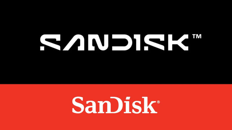
Sandisk has announced a rebranding. She abandoned the capital D in the middle of the title, a spelling that had been in use since 1995. The inspiration for the new logo was a “single data point” or “pixel”.

Image Source: Sandisk
The new logo again uses a serif font to spell out the company name, but it’s “bolder”; The “open” letter “D” has been retained, and is now combined with a truncated “pixelated “S”. These two letters symbolize “the collaboration and partnership needed to realize our purpose and seize new opportunities.”
Sandisk has rebranded ahead of its planned separation from parent company Western Digital next year. Western Digital acquired Sandisk in 2016. Last year, the company was embroiled in a scandal surrounding expensive SanDisk Extreme portable solid-state drives—the devices spontaneously deleted user data. The manufacturer never gave a clear explanation of what was happening; it released firmware updates that did not solve the problem and refused to issue refunds for faulty devices, prompting litigation.