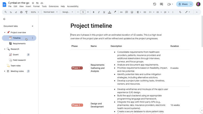
Google Docs introduces a tab feature to make it easier to organize and find information in long documents. The company announced the innovation in April, and now the feature will gradually appear to all users of corporate Google Workspace accounts and personal Google accounts – in some cases you will have to wait several weeks for it.

Image source: workspaceupdates.googleblog.com
Access to the tabs will appear in the web editor for desktop computers by clicking on the marker icon located in the upper left corner of the screen. Previously, this icon was labeled “Show Document Outline”, but now when you hover over it, the name “Show Tabs and Outlines” pops up. The user can manage several tabs, including sub-tabs – for example, in the “budget” section, you can create subsections dedicated to travel and food expenses.
Up to three levels of nesting of tabs are supported: you need to select the “Add subtab” command or drag one into another, making it nested. Each top-level or sub-tab can be given a custom label or emoji to quickly identify them. If a document contains one or more tabs, the tab navigation menu opens by default. You can also share a link directly to the tab. If you have access to edit the document, tabs can be renamed, copied, or deleted; otherwise, they can be viewed and used to navigate the document.