Apple has added several notable features in the fifth beta version of iOS 18, which was released yesterday. The design of the Photos app has been updated, a new option has appeared in the Safari browser, and there are a few other small changes.

Image source: Macrumors.com
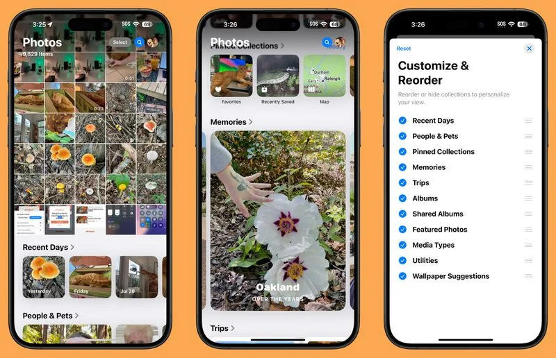
Apple has responded to feedback from early preview users of the new Photos app and has made additional design changes. In particular, it removed the carousel that allowed you to scroll through different collections of photos from the main grid of photos, resulting in the application becoming less confusing and with no duplicate elements. When opened, a grid of photos is displayed on the screen, but now there are more of them; You can also scroll down the grid to get to the collections. Users with multiple albums will see them higher up in the app, and recently saved content is now integrated into the Recent Days collection. The display order of collections can be changed.

Safari has a new option that allows you to hide distracting elements on web pages: cookie settings pop-ups, GDPR compliance notifications, newsletter sign-up banners, auto-playing videos and other things that can be annoying. This is not an ad blocker: advertising banners can be hidden while viewing the page, but if you reload the page, the ads will return because the function only works with static elements. To use the function, you will need to go to the settings and select “Hide distracting elements” – after that you can select the elements that will be hidden; There you can subsequently select the “Show hidden elements” option. Synchronization of the function is not supported, that is, you will have to hide elements on each device separately.

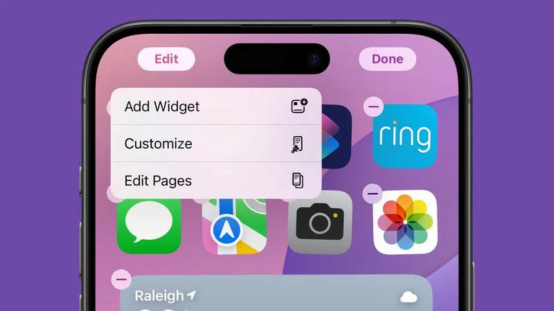
When you long press on the Home screen and select Edit, there’s a new Edit Pages option that lets you delete or hide entire Home screen pages from view. Some dark mode options have been redesigned, including the design of the Maps and Find My icons; The application search interface in dark mode has been fixed – previously it remained light. Apple has also redesigned a number of small interface elements, including icons in the Control Center.